

Building a website to be “responsive” involves defining a series of breakpoints and writing CSS code so that the site looks different on different devices. For example, a three-column site when viewed on a desktop will often use the first column to display section navigation whereas the same site when viewed on an iPad will usually be presented in two columns (the navigation being moved to the bottom of the main column).
Our approach is based on a popular framework called Bootstrap and we have defined eight different breakpoints each associated with slightly different layouts. The breakpoints are based on the width of the device being used to access the site.
Break Point (width): < 400px (default)
Typical users: People using small smartphones. (23% of total usage)
Typical layout: At this point users get a basic view of the site where the critical content is visible and we change the layout to make pages content scroll. We also use a hamburger to display the navigation.
- iPhone 3, 3G, 3GS (portrait): 320px x 480px
- iPhone 4, 4S (portrait): 320px x 480px
- iPhone 5, 5C (portrait), 5S: 320px x 568px
- iPhone 6, 6S (portrait): 375px x 667px
- HTC 8X: 320px x 490px
Break Point (width): >= 400px
Typical users: People using small smartphones in landscape mode, large smartphones and small tablets. (4% of total usage)
Typical layout: At this screen size we keep a similar layout to the above but we increase the size of certain features to make them more easily clicked or read.
- iPhone 3, 3G, 3GS (landscape): 480px x 320px
- iPhone 4, 4S (landscape): 480px x 320px
- iPhone 5, 5C (landscape), 5S: 568px x 320px
- iPhone 6 Plus (portrait): 414px x 736px
- Microsoft Lumia 1520: 432px x 768px
- Amazon Kindle Fire HD 7: 480px x 800px
- Asus Nexus 7: 600px x 960px
Break Point (width): >= 640px
Typical users: People using large smartphones in landscape mode and people using tablets. (12% of total usage)
Typical layout: At this screen size we often introduce a second column to the page containing a sub-navigation or other features such as staff rotators.
- iPhone 6, 6S (landscape): 667px x 375px
- iPhone 6 Plus (landscape): 736px x 414px
- iPad mini (portrait): 768px x 1024px
- iPad (1st, 2nd generation): 768px 1024px
- Microsoft Surface Pro 2: 720px x 1280px
- HTC Nexus 9 (portrait): 768px x 1024px
Break Point (width): >= 800px
Typical users: Mid sized tablets (primarily the Samsung Galaxy Tab). (1% of total usage)
Typical layout: Typical adjustments would be to introduce a full navigation compared to the hamburger we use at smaller sizes.
- Samsung Galaxy Tab: 800px x 1280px
- Amazon Kindle Fire HD 8.9: 800px x 1280px
Break Point (width): >= 900px
Typical users: People using tablets (6%)
Typical layout: Typical adjustments would be to increase the font size, and introduce a third column if applicable.
- iPad Pro (portrait): 1024px x 1366px
- ipad mini (landscape): 1024px x 768px
- Microsoft Surface Pro 3 (portrait): 1024px x 1440px
- HTC Nexus 9 (portrait): 1024px x 768px
Break Point (width): >= 1280px
Typical users: People with large tablets in landscape mode and standard laptop screens. (37% of total usage)
Typical layout: At this size the site goes into the "desktop" layout where all features and content are visible.
- Samsung Galaxy Tab (landscape): 1280px x 800px
- Amazon Kindle Fire HD 8.9 (landscape): 1280px x 800px
- Microsoft Surface Pro 3 (landcape): 1440px x 1024px
- iPad Pro (landscape): 1024px x 1366px
- iPad (3rd, 4th, 5th gen): 1536px x 2048px
- iPad mini 2,3,4: 1536px x 2048px
- MacBook Pro 13.3': 1280px x 800px
- MacBook Pro 15' (retina display): 1440 x 900px
- MacBook Air 11.6': 1366px x 768px
- MacBook Air 13': 1440px x 900px
Break Point (width): >= 1600px
Typical users: People with very large laptops and large desktop screens. (16% of total usage)
Typical layout: We now focus on stopping images stretching too far and allowing margins to fill any space to stop the site distorting.
- MacBook Pro 17': 1920px x 1200px
- iMac 21.5': 1920px x 1080px
Break Point (width): >= 2000px
Typical user: People with very large desktops and tv monitors. (1% of total usage)
Typical layout: Typically at this screen size we make fonts and buttons larger. We also still focus on stopping images from distorting
- iMac 27': 2560px x 1440px
- Apple 30" Cinema Display: 2560px x 1600px
- Dell UltraSharp U2711 27" Monitor: 2560px x 1440px
With these breakpoints we are able to make sure that the websites we build look great on every device. While the guideline above gives a good example of how our sites use a responsive layout, we also customise each site to either have custom breakpoints or make changes at different screen sizes depending on content and design. This allows for each site to be completely optimised for that sites users.
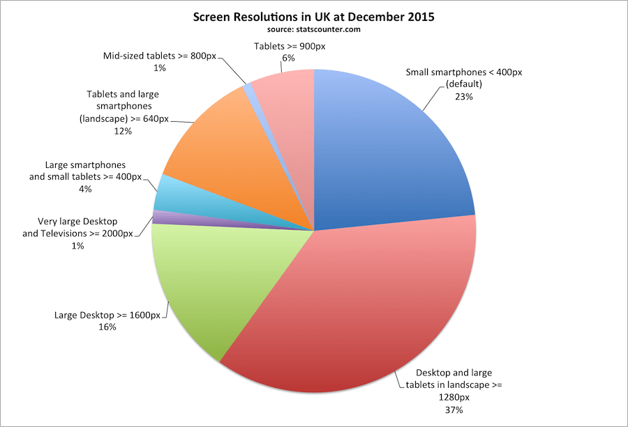
This chart has been produced from information about resolutions as reported by www.statscounter.com and is filtered so that it relates only to United Kingdom during December 2015.